Visual branding suite
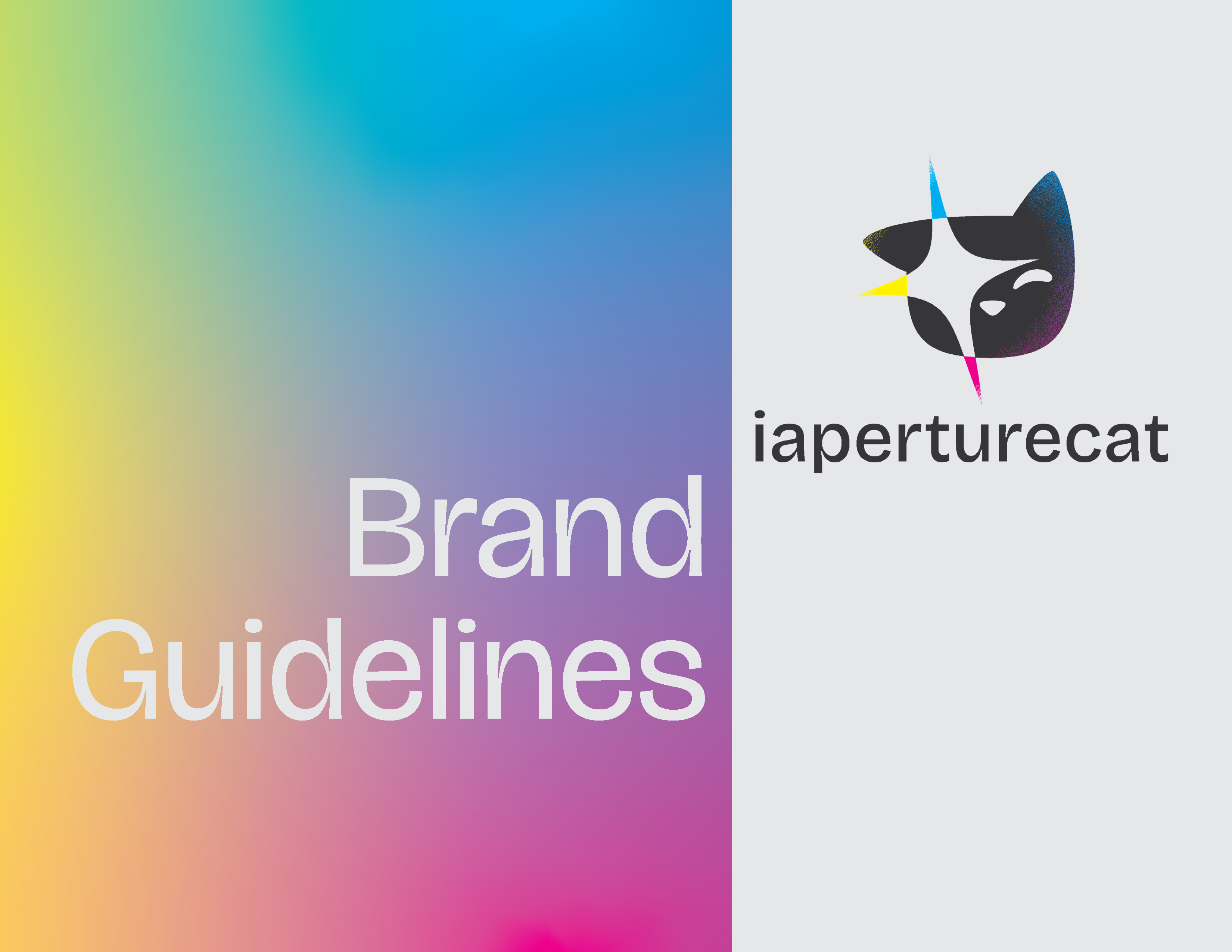
iaperturecat photography
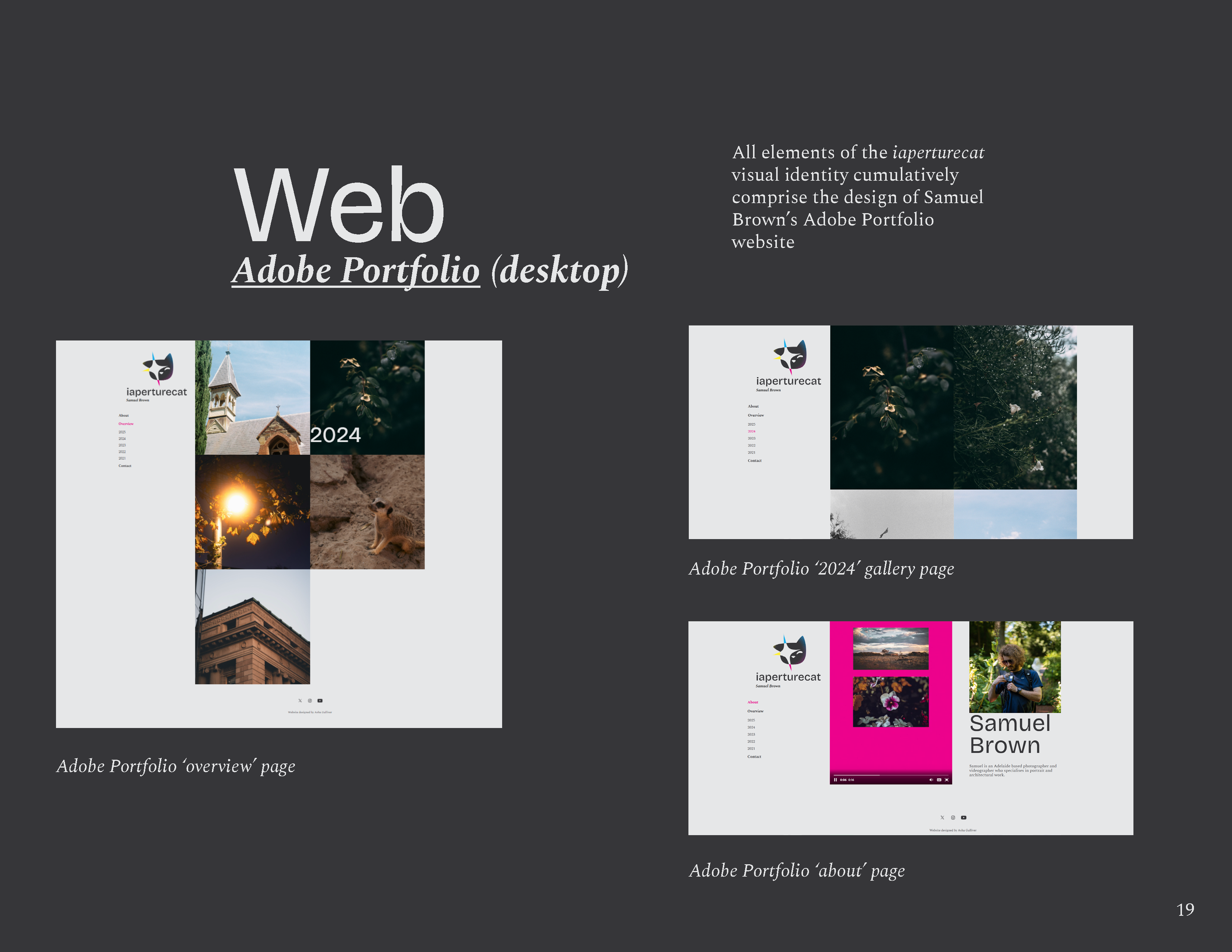
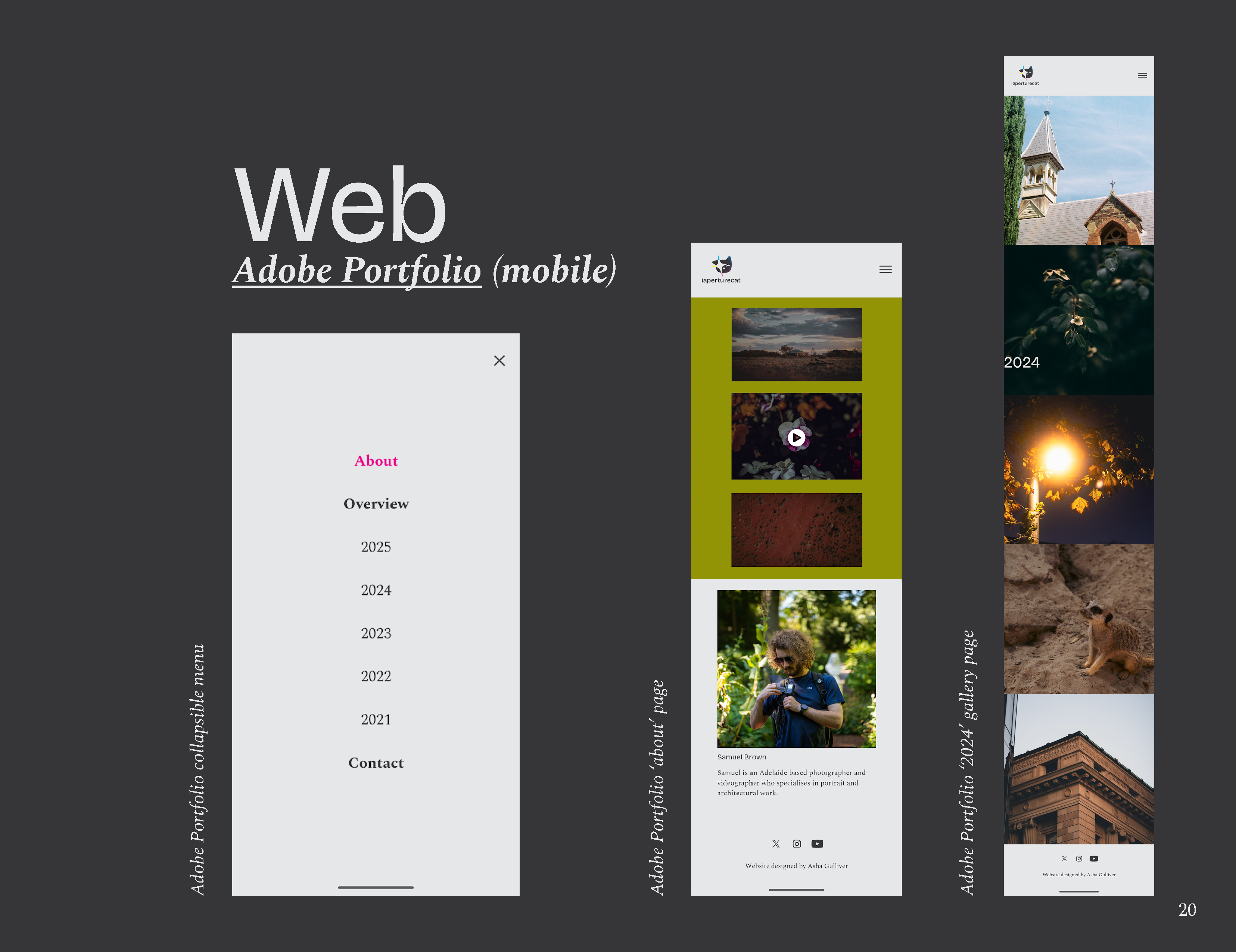
This project is a branding suite for independent, Adelaide-based photographer and videographer, Samuel Brown, professionally known as iaperturecat. In scope, it covers logo design, colour, typography, and an array of digital applications - including social media optimised branding and video assets - all collated in a comprehensive brand guidelines document.
Icon
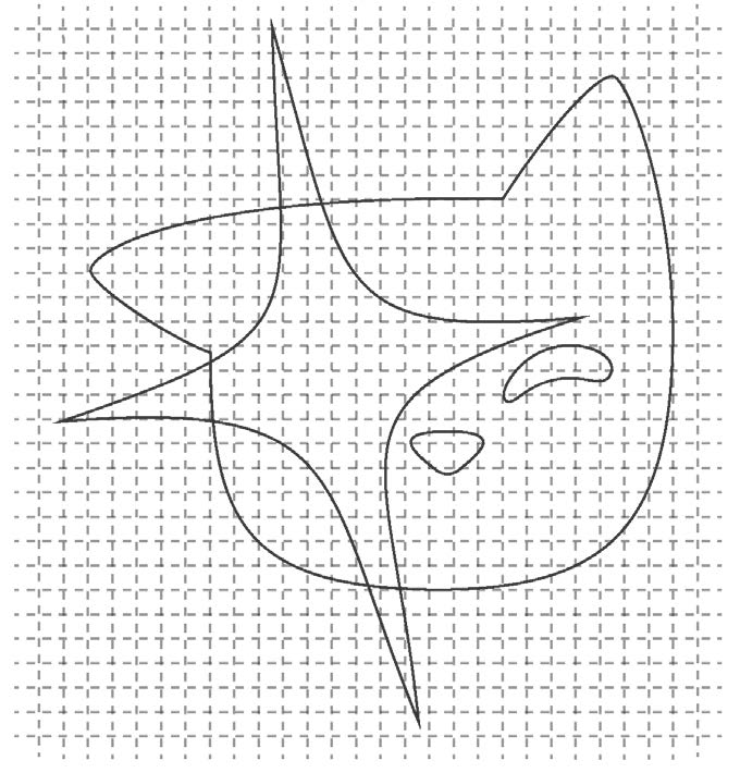
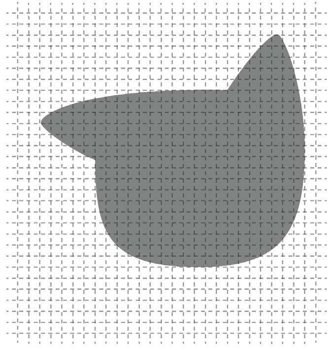
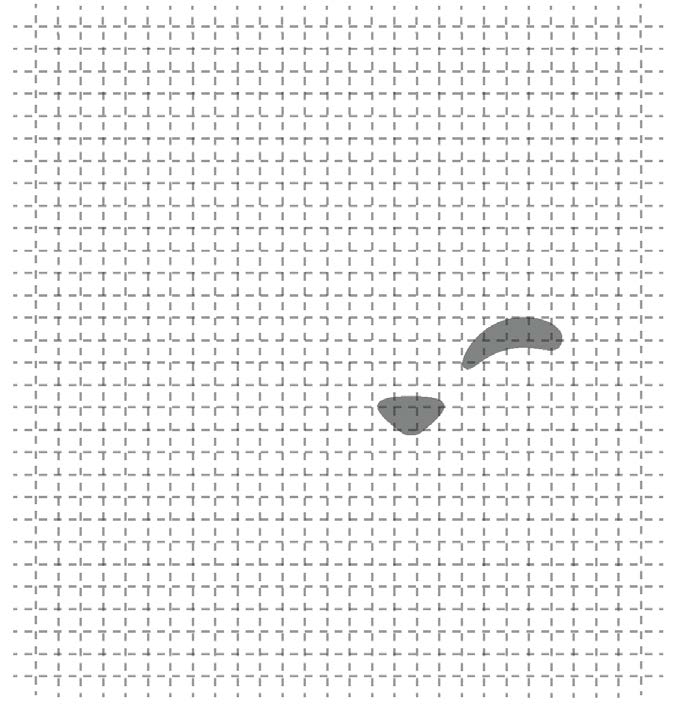

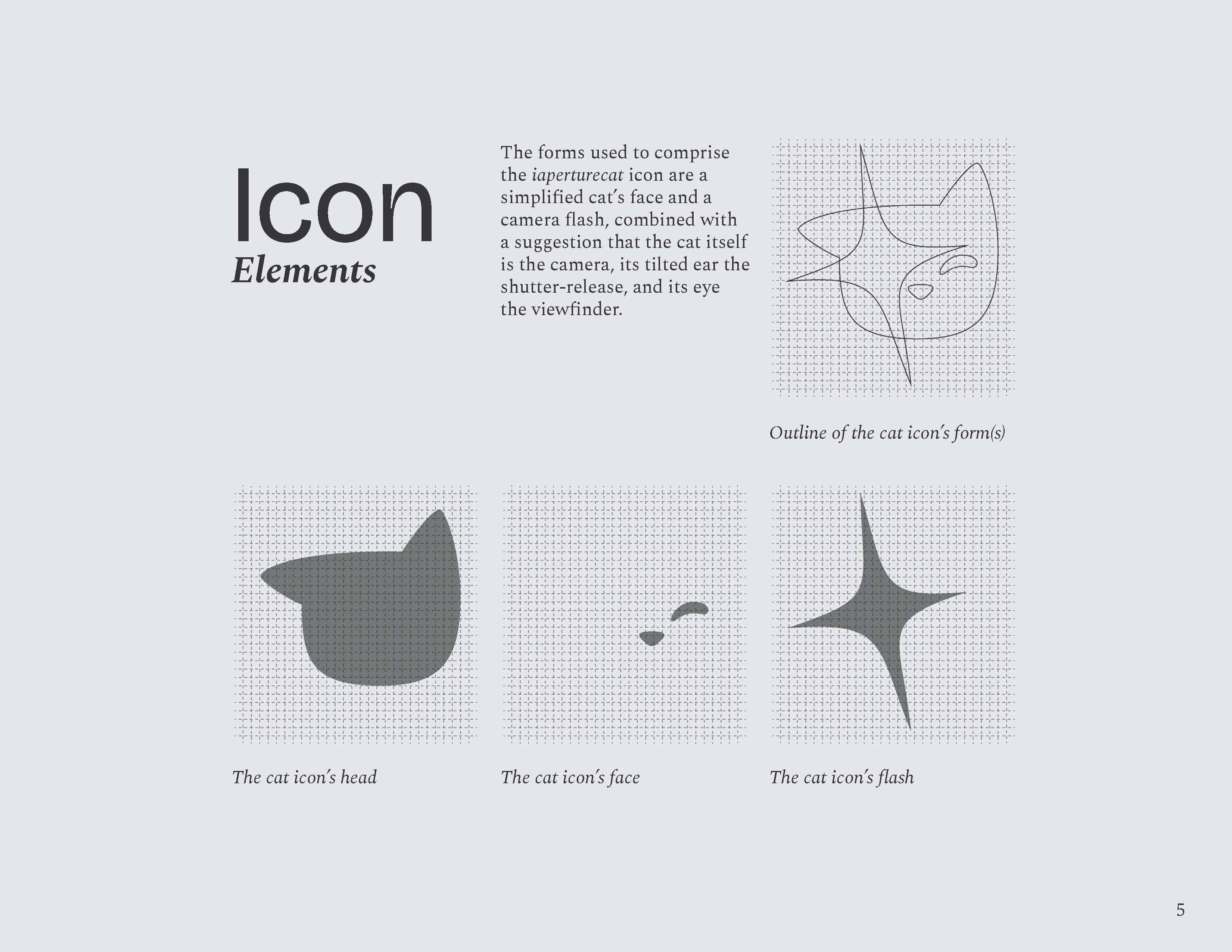
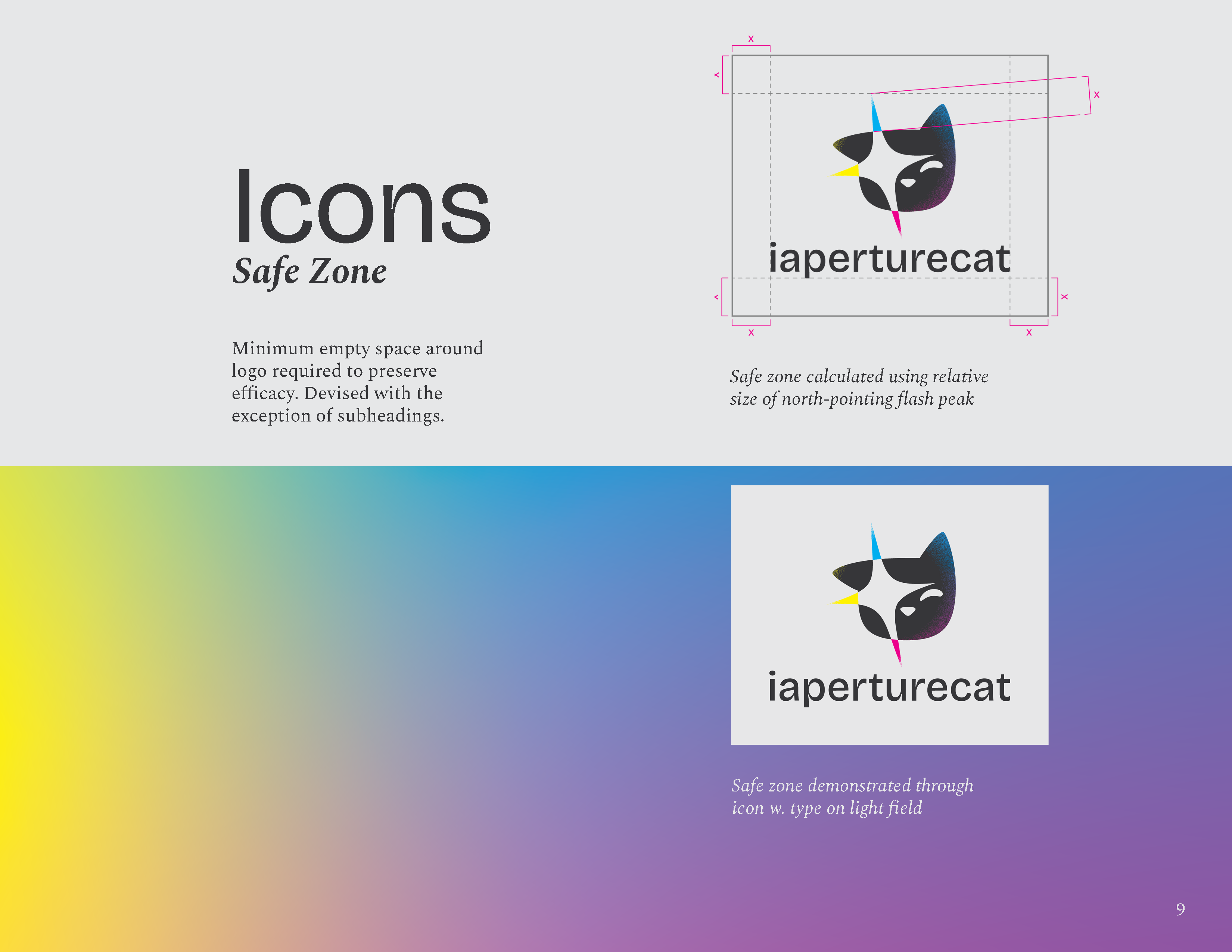
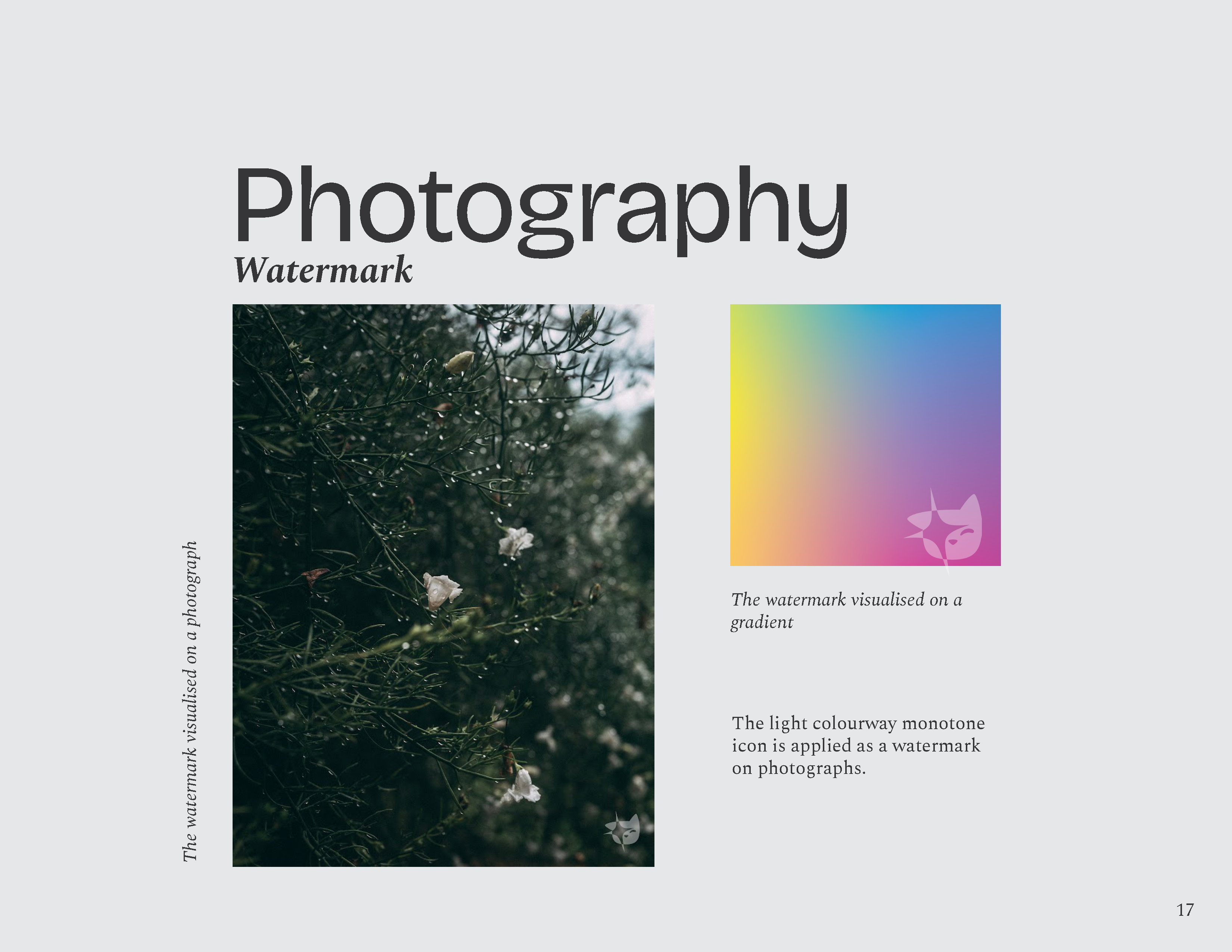
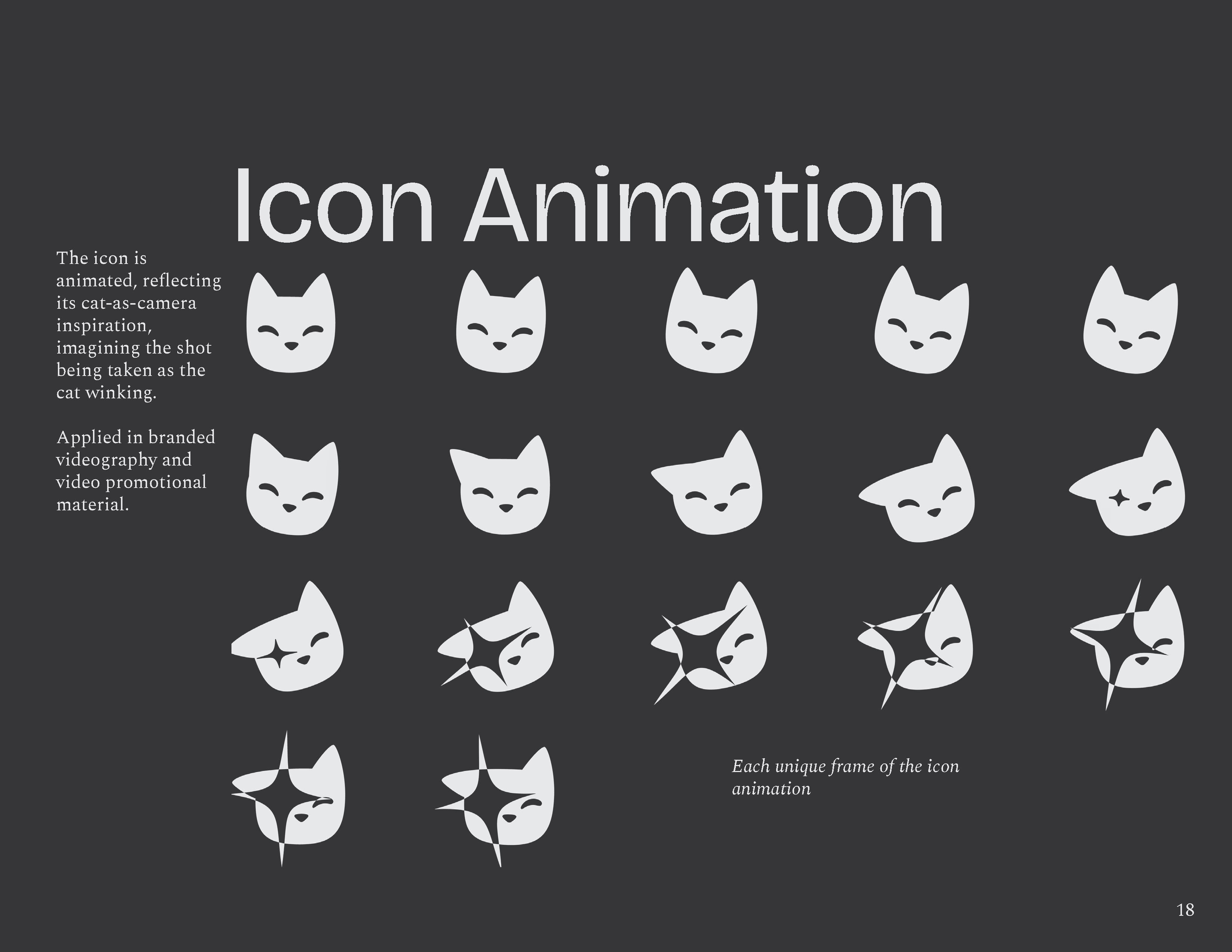
The forms used to comprise the iaperturecat icon are a simplified cat’s face and a camera flash. This imagery combined presents the cat itself as a camera; its tilted ear the shutter-release, and its eye the viewfinder.

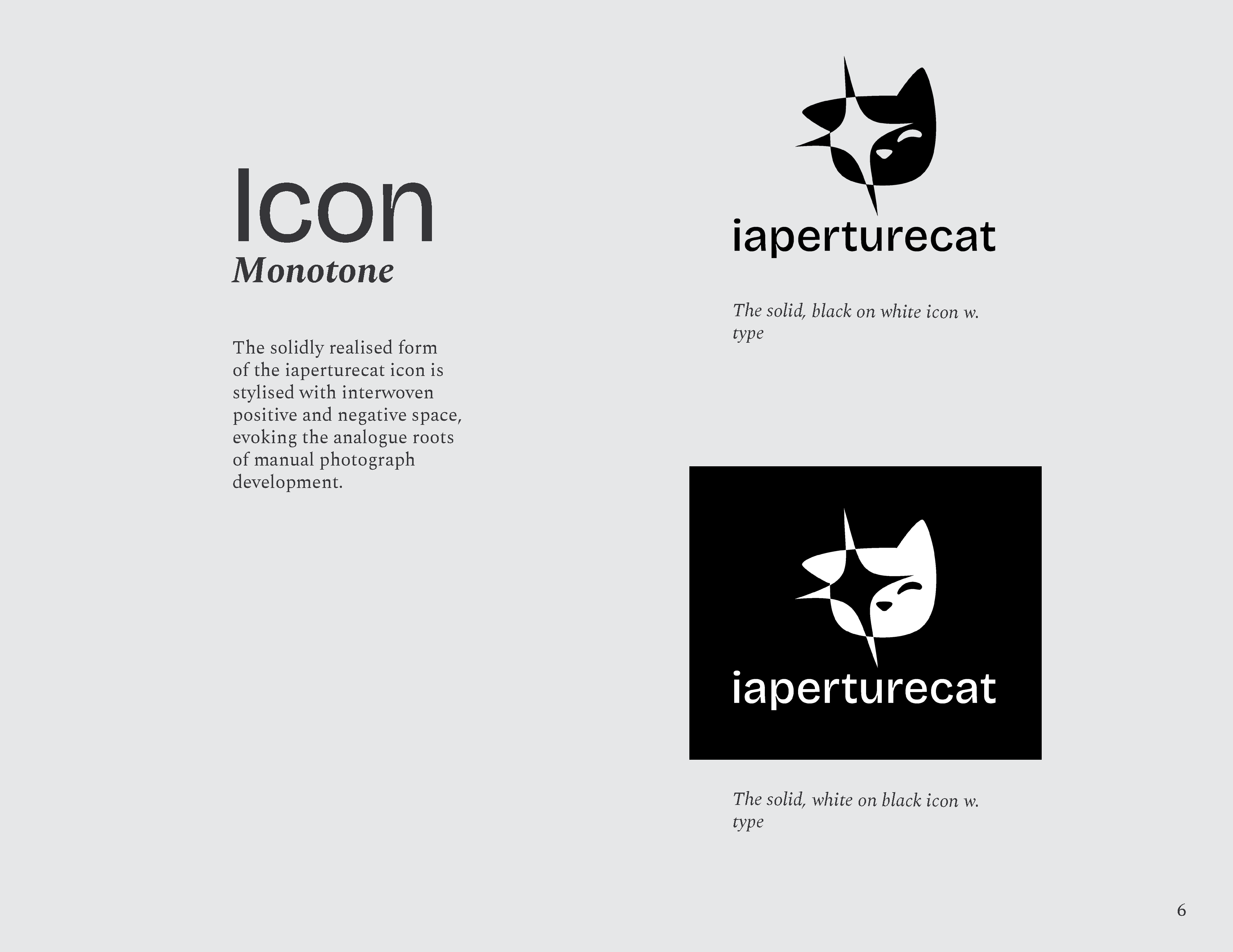
The icon is stylised with interwoven positive and negative space, evoking analogue photo development.

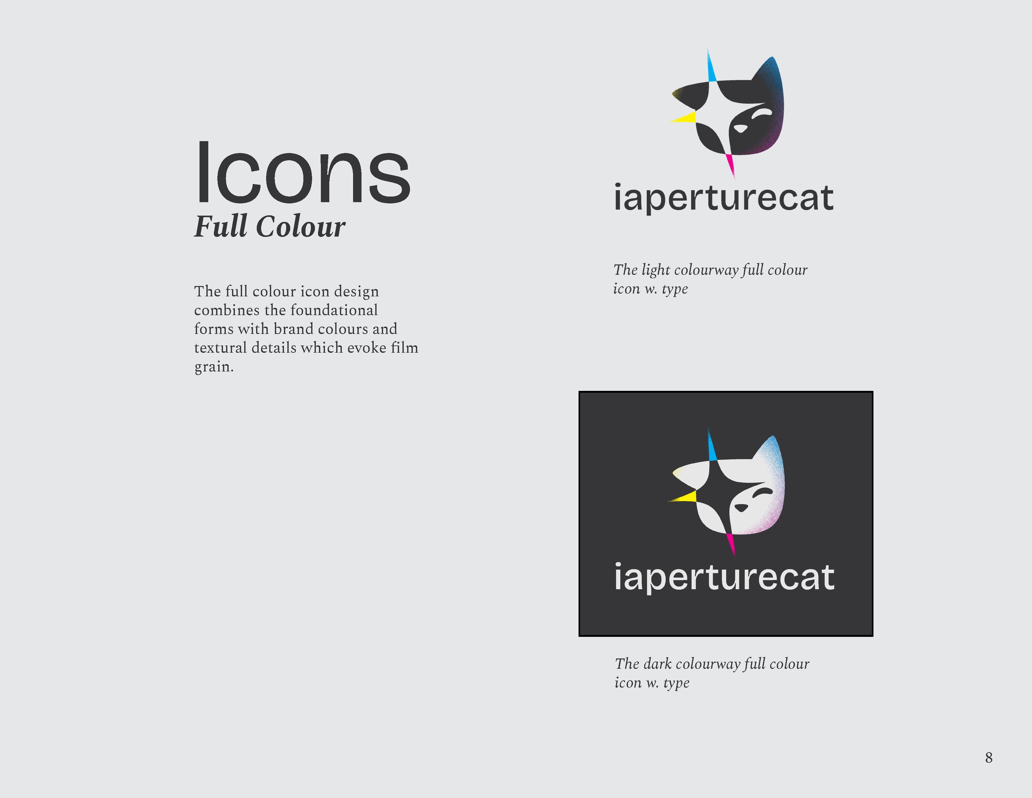
The colourised icon combines the composite forms with brand colours and film-grain-esque texture.
Colour

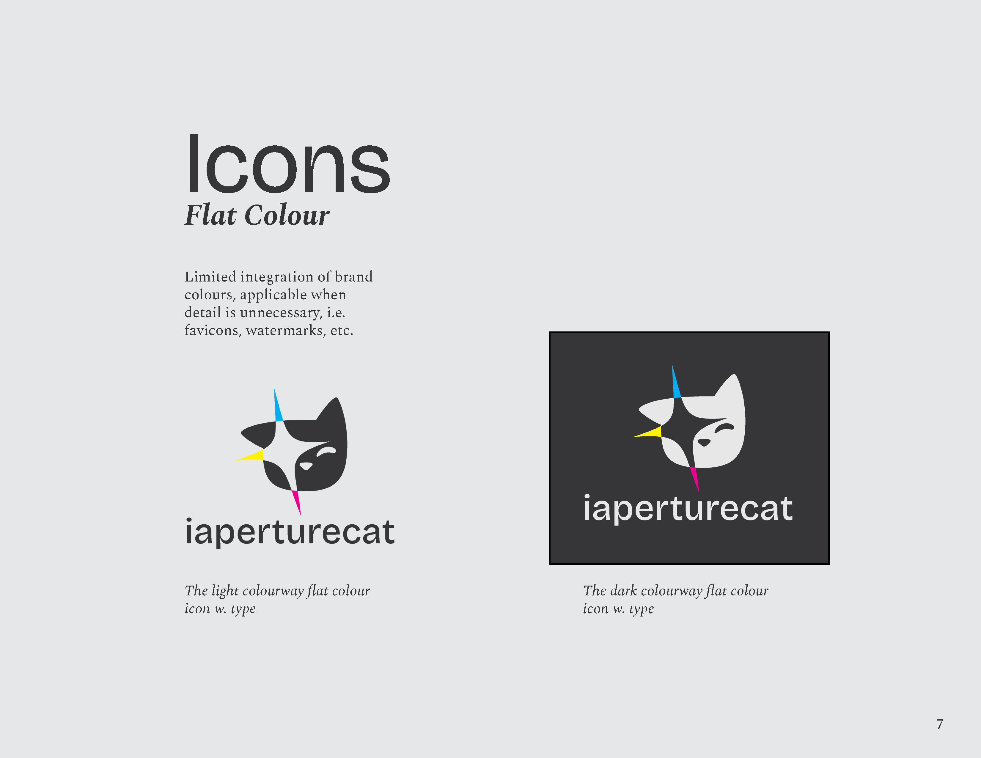
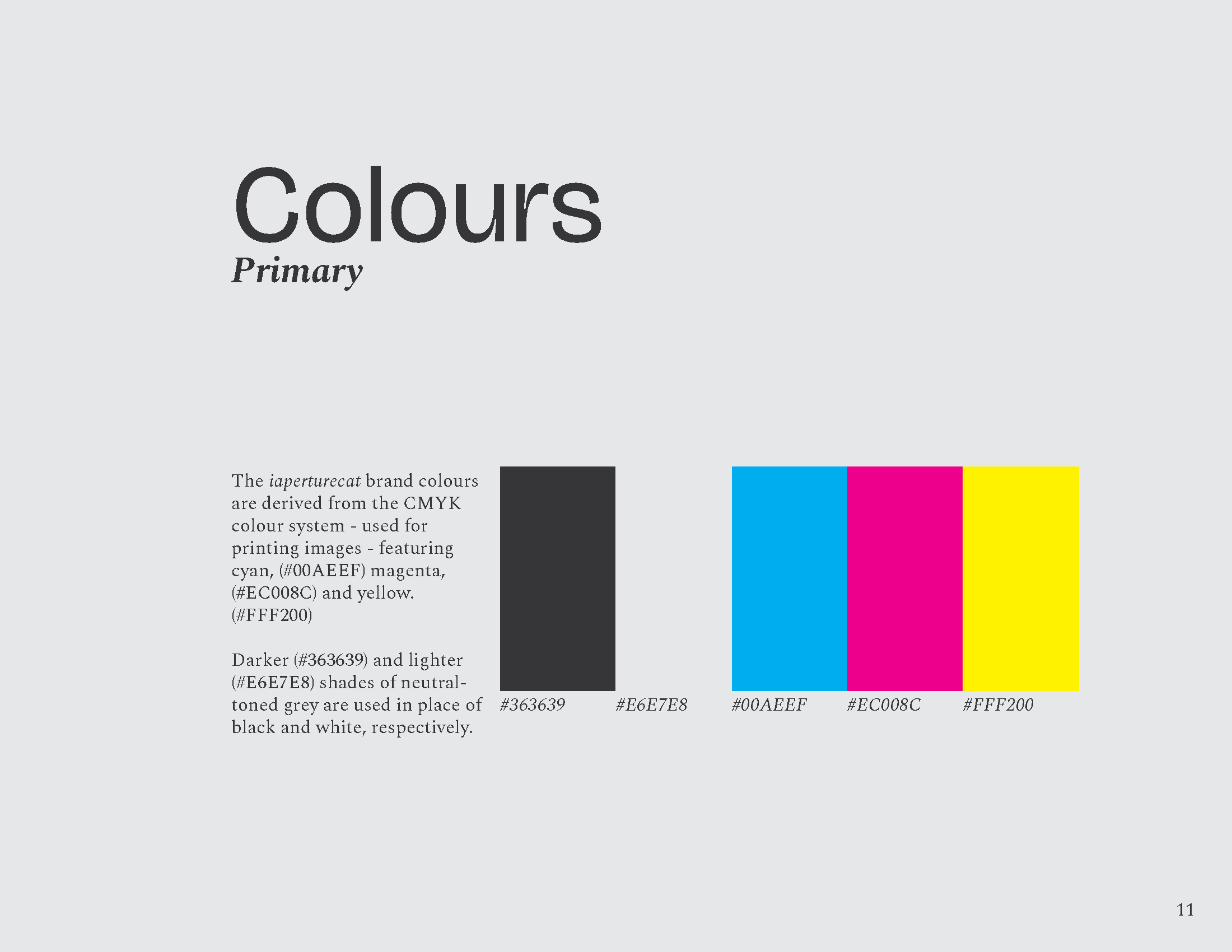
The iaperturecat brand colours are derived from the CMYK colour system - used for printing images - featuring cyan, magenta, and yellow, as well as two shades of neutral-toned grey, used in place of black and white.
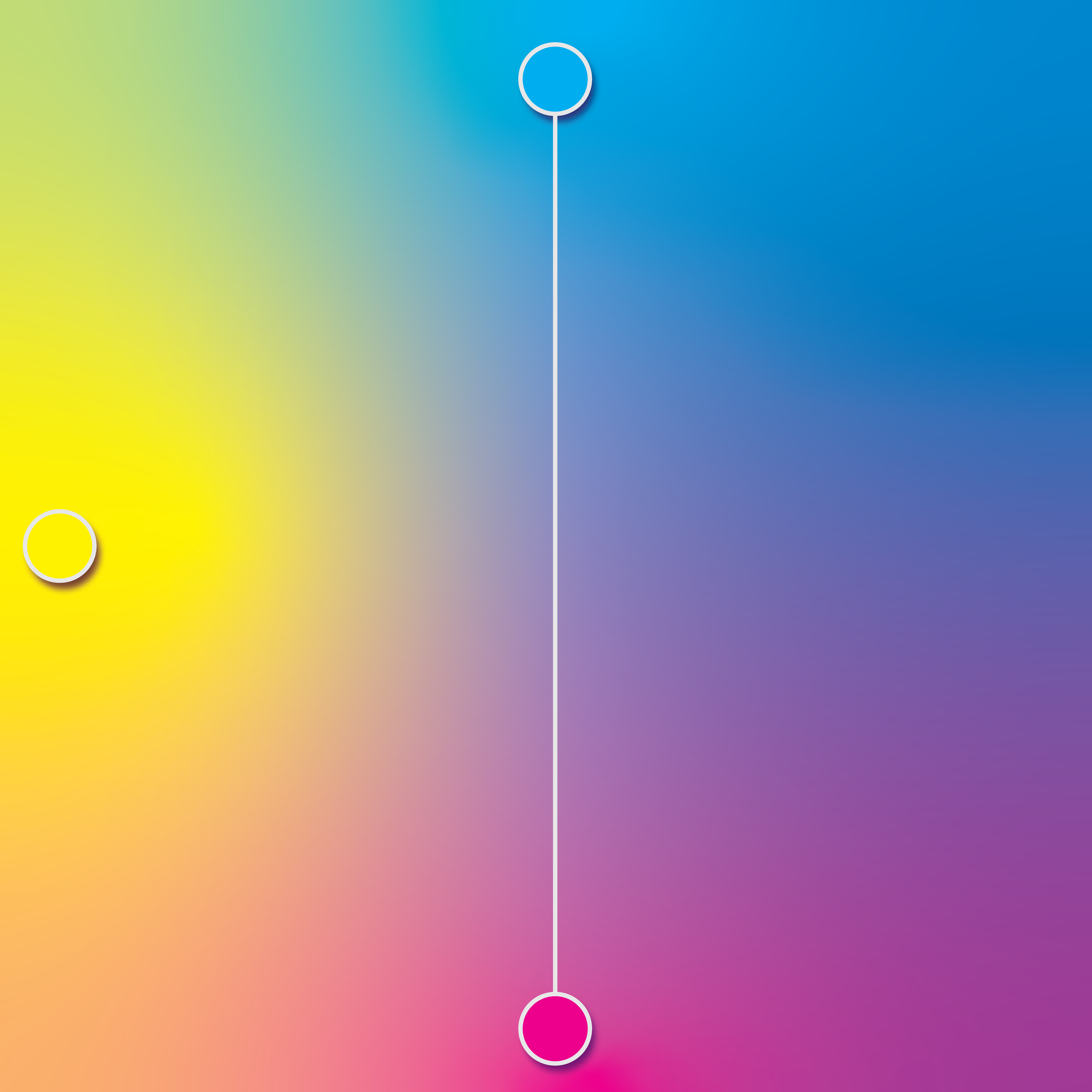

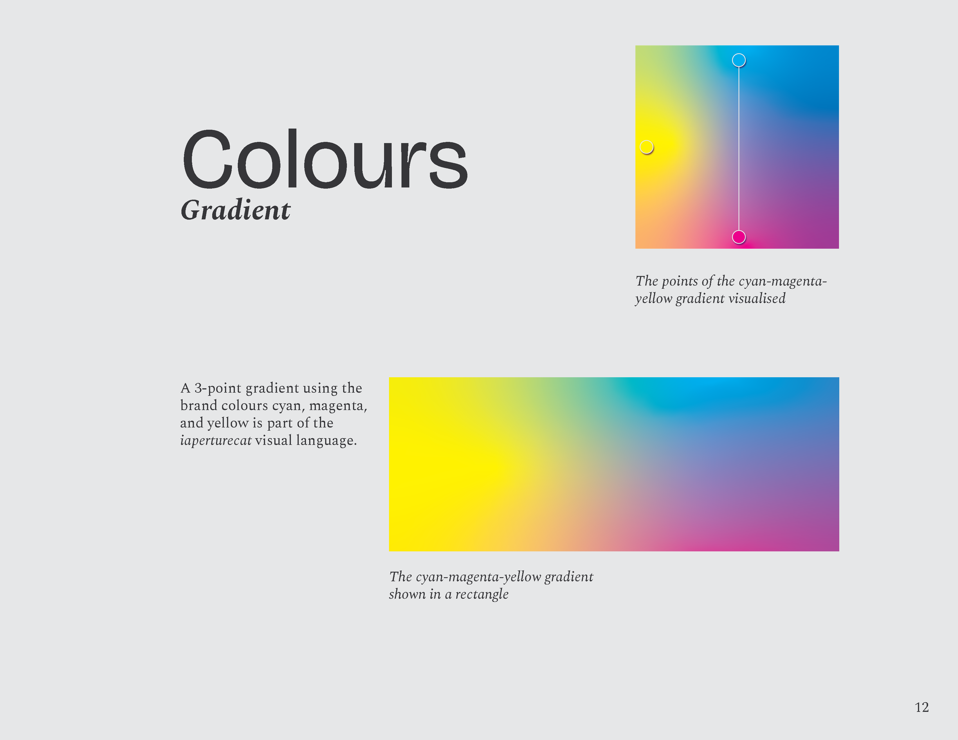
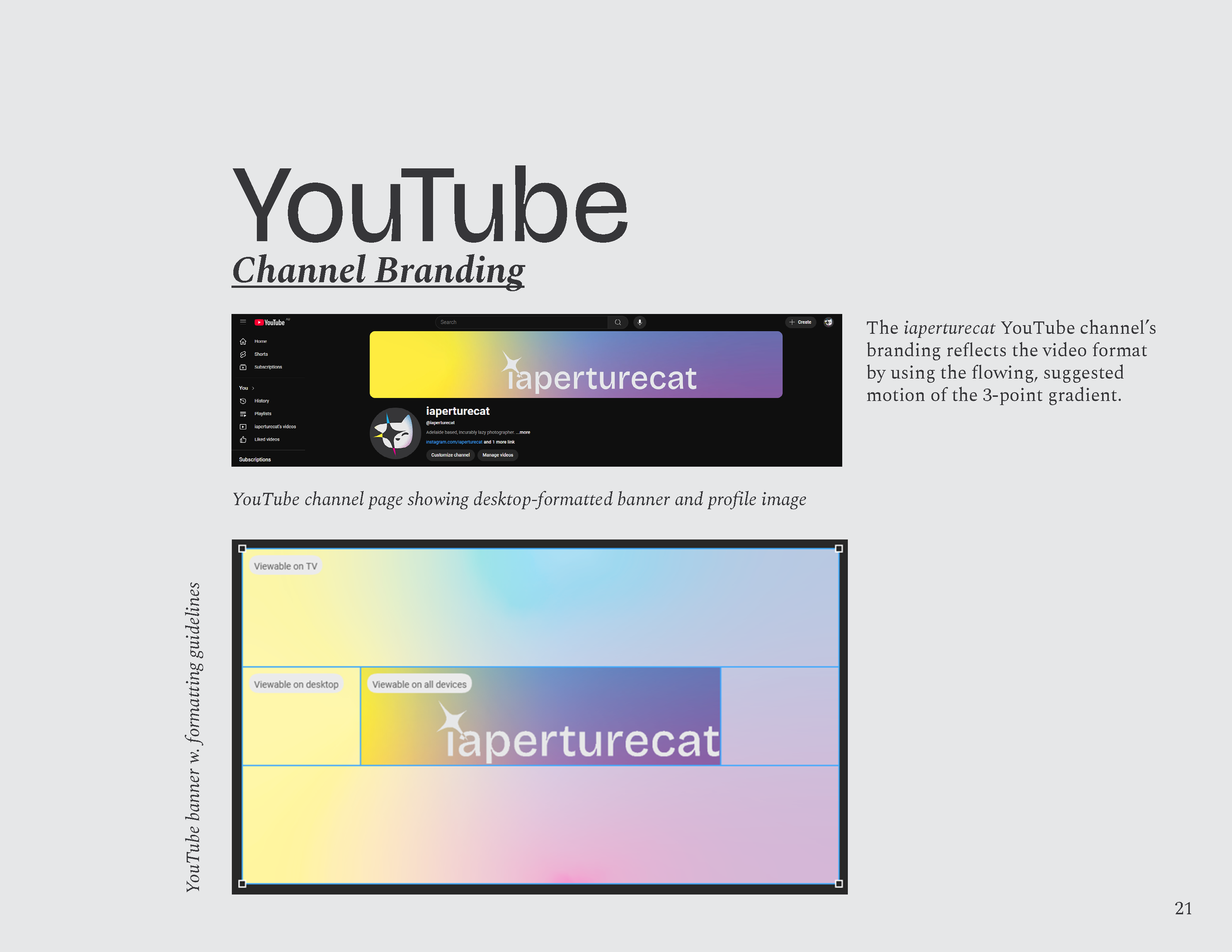
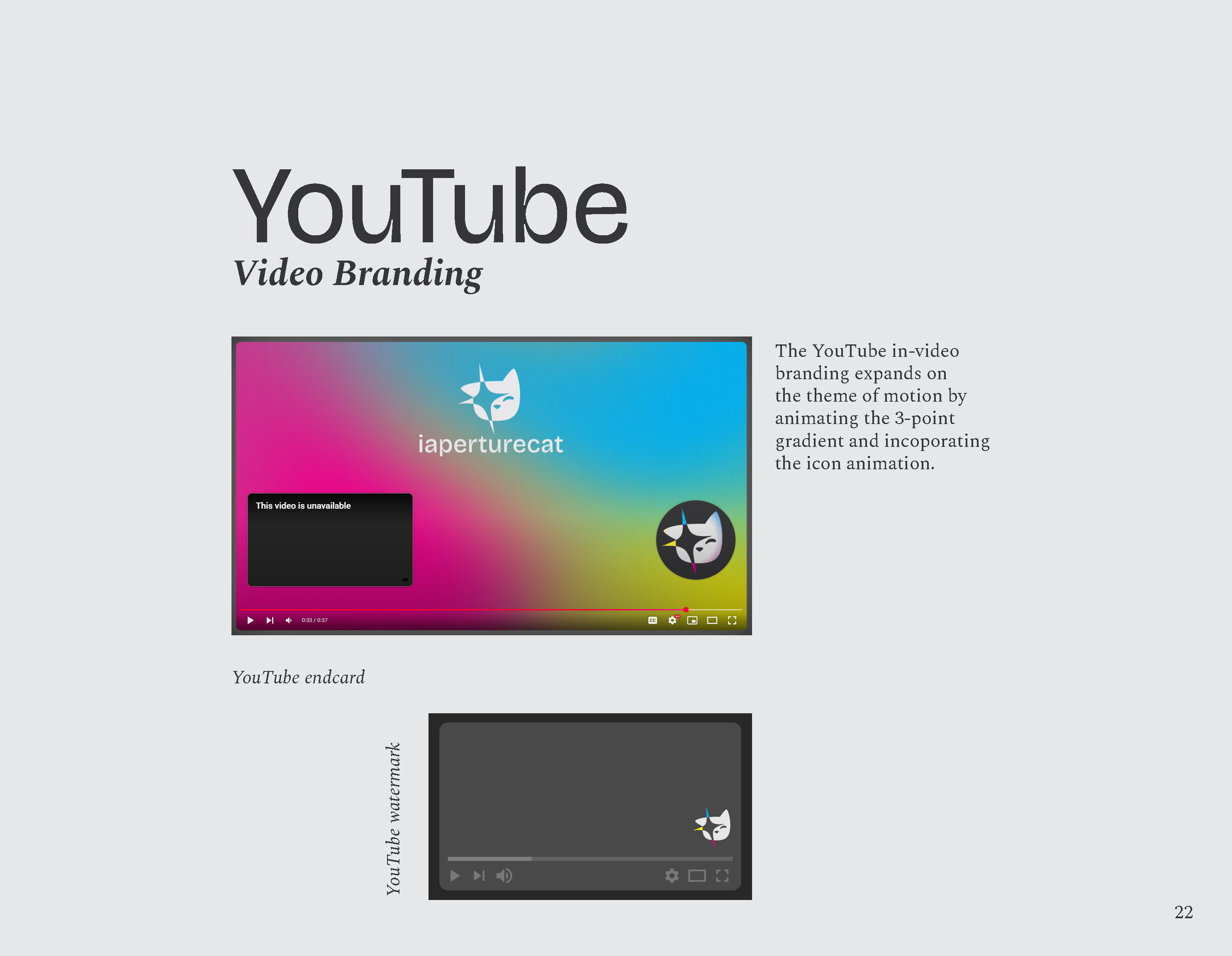
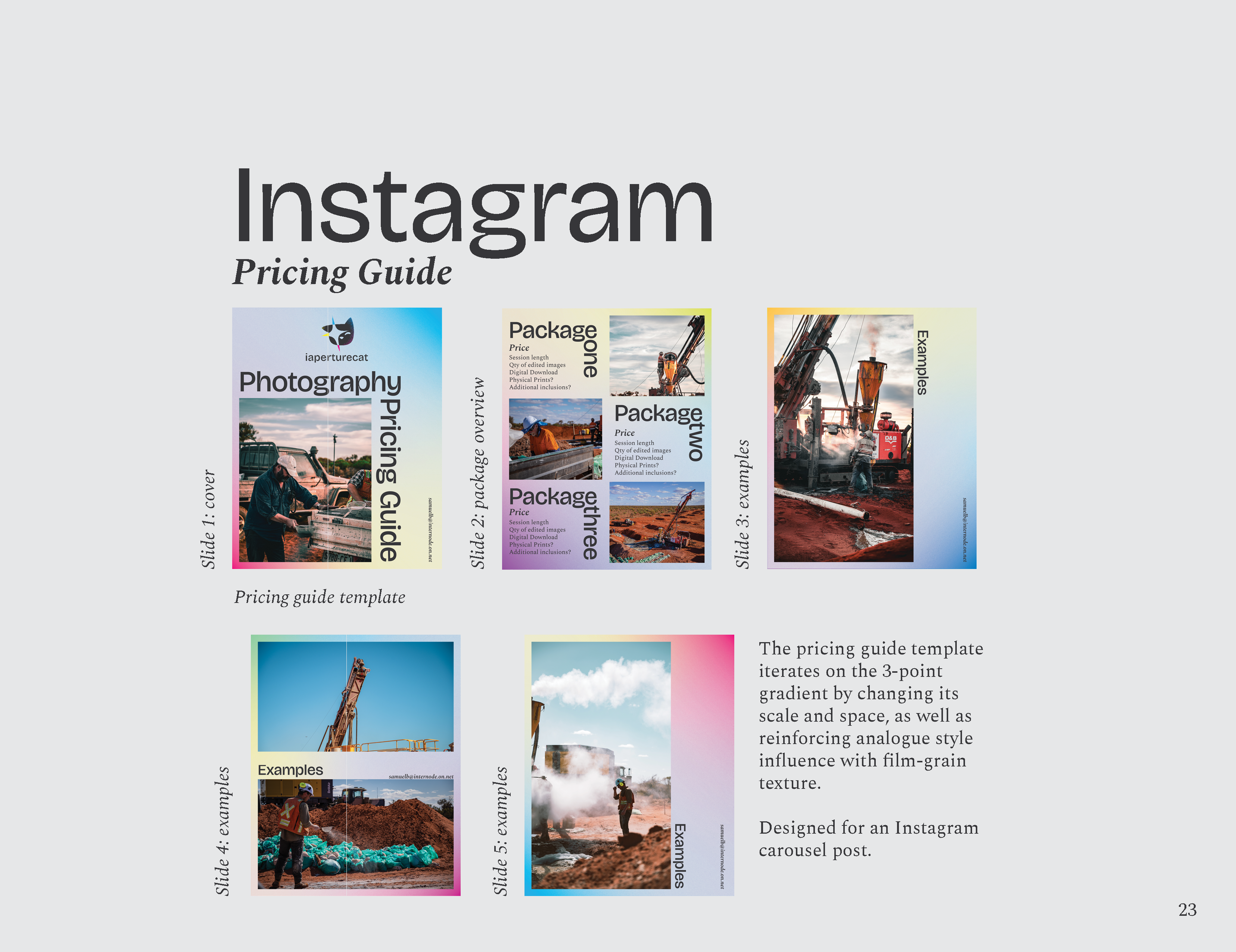
A 3-point gradient using the key brand colours is part of the iaperturecat visual language.
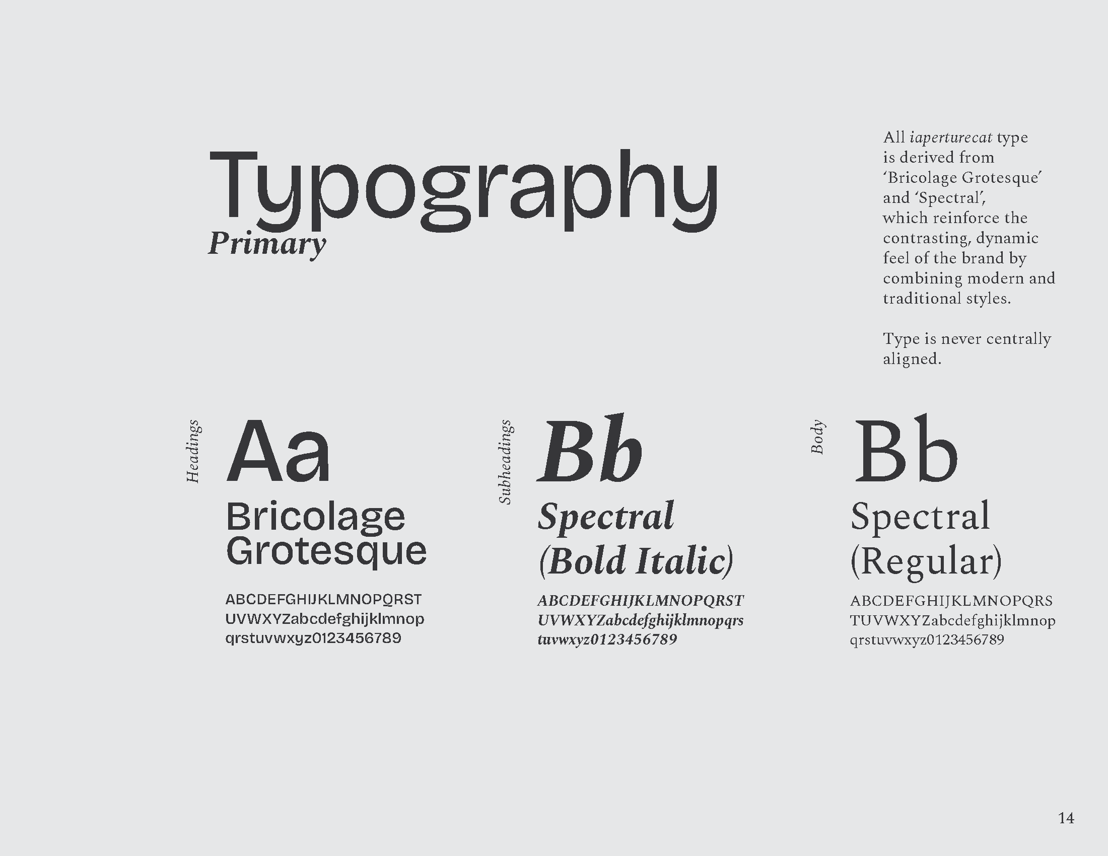
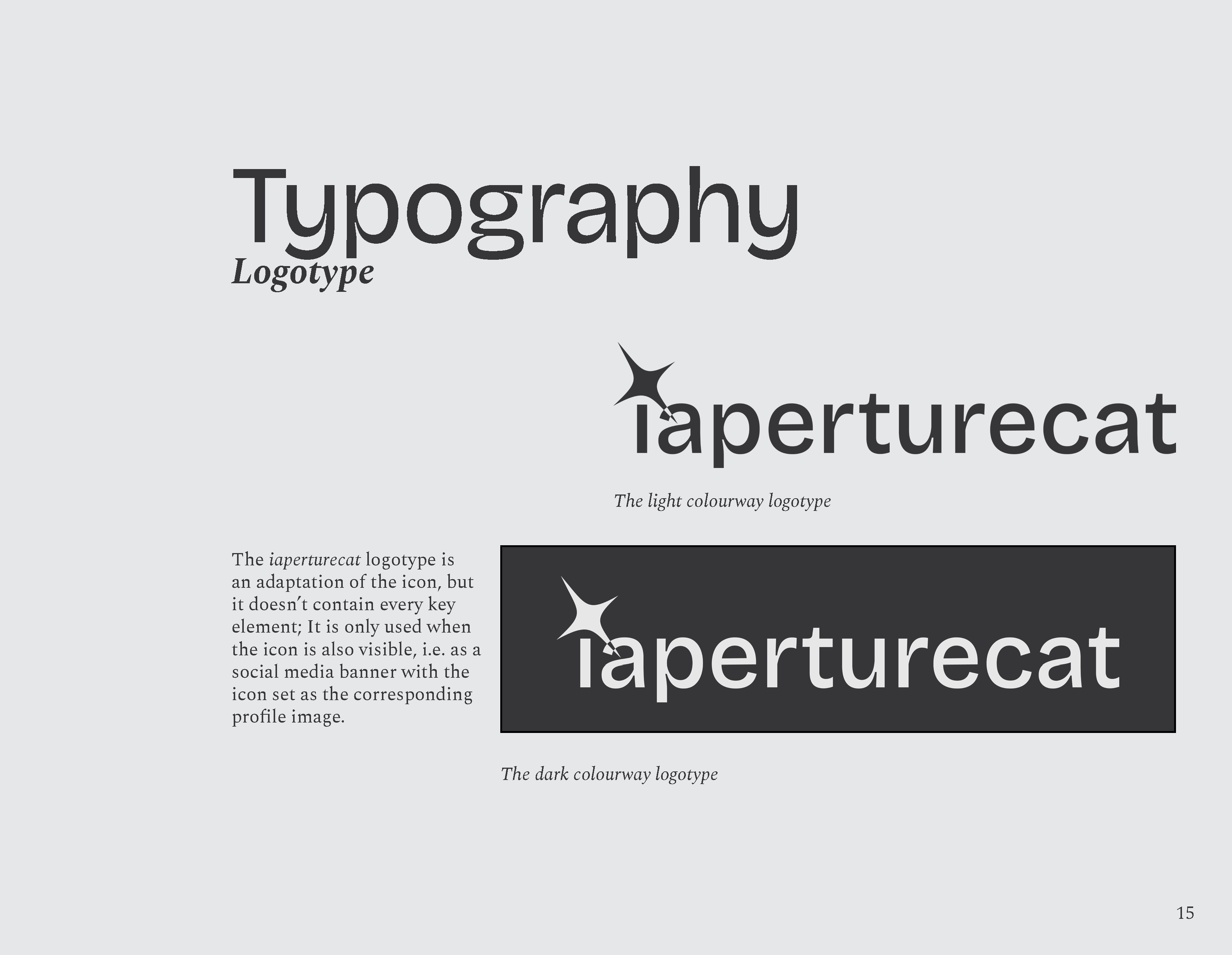
Typography
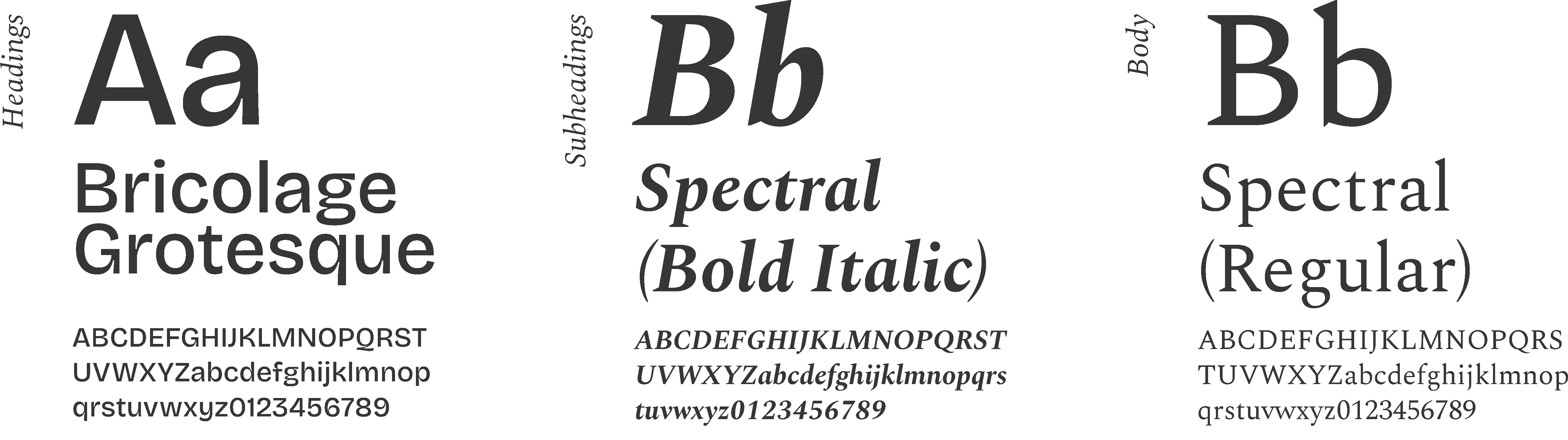
All iaperturecat type is derived from ‘Bricolage Grotesque’ and ‘Spectral’.

Both neutral and stylised logotype forms use ‘Bricolage Grotesque’.
Application
For application in branded videography and video promotional, the icon and type is animated, imagining the cat's wink as a shot from a camera.
In-video branding applies an animated version of the 3-point gradient and incoporates the icon animation.
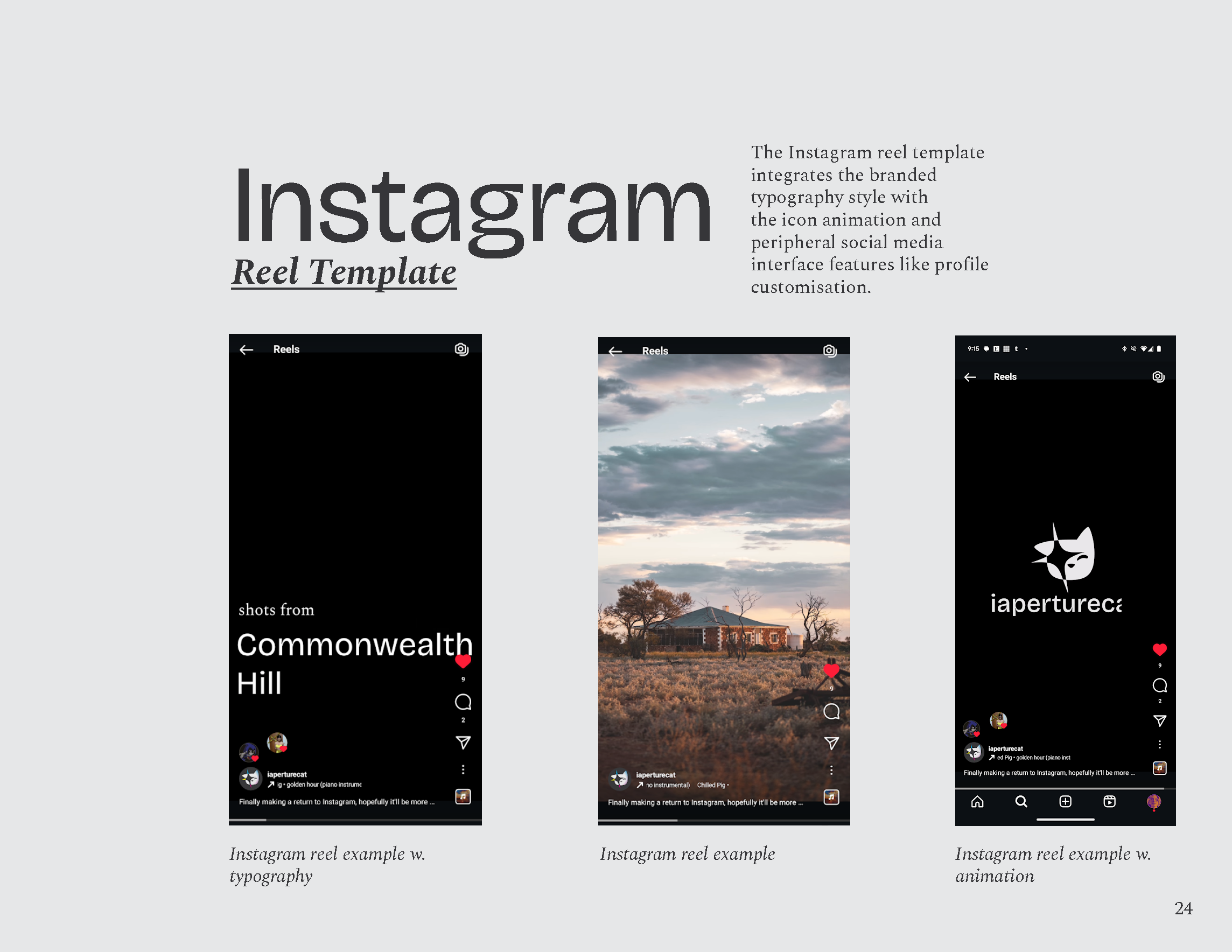
The sample Instagram reel integrates the branded typography style with the icon animation and peripheral social media interface features like profile customisation.

Sample editorial style promotion utilising the brands visual language.